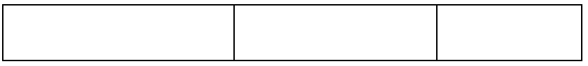
[quiz01]
<!DOCTYPE html>
<html lang="en">

<head>
    <meta charset="UTF-8">
    <meta name="viewport" content="width=device-width, initial-scale=1.0">
    <title>Document</title>
</head>

<body>
    <style>
        * {
            box-sizing: border-box;
        }

        div {
            border: 1px solid black;
        }

        .container {
            width: 1000px;
            height: 100px;
        }

        .box {
            float: left;
            height: 100%;
        }

        #box1 {
            width: 40%;
        }

        #box2 {
            width: 35%;
        }

        #box3 {
            width: 25%;
        }
    </style>

    </head>

    <body>


        <!-- 가로 삼단 구조 -->
        <div class="container">
            <div class="box" id="box1"></div>
            <div class="box" id="box2"></div>
            <div class="box" id="box3"></div>
        </div>
    </body>

</html>
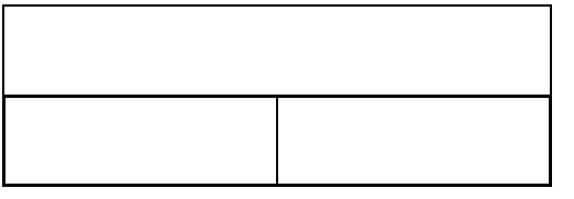
[quiz02]
<!DOCTYPE html>
<html lang="en">

<head>
    <meta charset="UTF-8">
    <meta name="viewport" content="width=device-width, initial-scale=1.0">
    <title>Document</title>
    <style>
        * {
            box-sizing: border-box;
        }

        div {
            border: 1px solid black;
        }

        .container {
            width: 600px;
            height: 200px;
        }

        .row {
            height: 50%;
        }

        .col {
            float: left;
            width: 50%;
            height: 100%;
        }
    </style>
</head>

<body>
    <div class="container">
        <div class="row">
        </div>
        <div class="row">
            <div class="col"></div>
            <div class="col"></div>
        </div>
    </div>

</body>

</html>
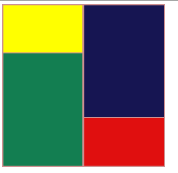
[quiz03]
<!DOCTYPE html>
<html lang="en">

<head>
    <meta charset="UTF-8">
    <meta name="viewport" content="width=device-width, initial-scale=1.0">
    <title>Document</title>
    <style>
        * {
            box-sizing: border-box;
        }

        div {
            border: 1px solid rgb(206, 144, 144);
        }

        .container {
            width: 400px;
            height: 400px;
        }

        .col {
            width: 50%;
            height: 100%;
            /* height:100%; */
            float: left;

        }

        .row {
            width: 100%;
            /* height: 100%; */
        }


        #row1 {
            height: 30%;
            background-color: yellow;

        }

        #row2 {
            height: 70%;
            background-color: rgb(19, 126, 81);
        }

        #row3 {
            height: 70%;
            background-color: rgb(22, 21, 82);
        }

        #row4 {
            height: 30%;
            background-color: rgb(224, 15, 15);
        }
    </style>
</head>

<body>
    <div class="container">
        <div class="col">
            <div class="row" id="row1"></div>
            <div class="row" id="row2"></div>
        </div>
        <div class="col">
            <div class="row" id="row3"></div>
            <div class="row" id="row4"></div>
        </div>
    </div>

</body>

</html>
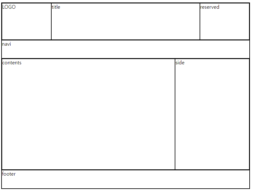
[quiz04]
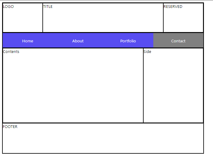
기본 레이아웃
<!DOCTYPE html>
<html lang="en">

<head>
    <meta charset="UTF-8">
    <meta name="viewport" content="width=device-width, initial-scale=1.0">
    <title>Document</title>
</head>
<style>
    * {
        box-sizing: border-box;
    }

    div {
        border: 1px solid black;
    }

    .container {
        width: 800px;
        height: 600px;
        margin: auto;
    }

    /* 헤더 css */
    .header {
        height: 20%;
    }

    .header div {
        float: left;
        height: 100%;
    }

    .logo {
        width: 20%
    }

    .title {
        width: 65%
    }

    .reserved {
        width: 15%
    }


    /* navi css */
    .navi {
        height: 10%;
    }


    /* main css */
    .main {
        height: 55%;
    }

    .main div {
        float: left;
        height: 100%;
    }

    .contents {
        width: 70%;
    }

    .side {
        width: 30%;
    }


    .footer {
        height: 15%;
    }
</style>

<body>
    <div class="container">
        <div class="header">
            <div class="logo">LOGO</div>
            <div class="title">title</div>
            <div class="reserved">reserved</div>

        </div>
        <div class="navi">navi</div>
        <div class="main">
            <div class="contents">contents</div>
            <div class="side">side</div>
        </div>
        <div class="footer">footer</div>
    </div>
</body>

</html>
navi 추가된 최종소스
<!DOCTYPE html>
<html lang="en">

<head>
    <meta charset="UTF-8">
    <meta name="viewport" content="width=device-width, initial-scale=1.0">
    <title>Document</title>
</head>
<style>
    * {
        box-sizing: border-box;
    }

    div {
        border: 1px solid black;
    }

    .container {
        width: 800px;
        height: 600px;
        margin: auto;
    }

    /* 헤더 css */
    .header {
        height: 20%;
    }

    .header div {
        float: left;
        height: 100%;
    }

    .logo {
        width: 20%
    }

    .title {
        width: 65%
    }

    .reserved {
        width: 15%
    }


    /* navi css */
    .navi {
        height: 10%;
    }

    .navi ul {
        /* border: 1px solid red; */
        padding: 0px;
        height: 100%;
        margin: 0px;

    }

    .navi li {
        list-style-type: none;
        background-color: blanchedalmond;
        /* border: 1px solid blue; */
        float: left;
        width: 25%;
        height: 100%;
        line-height: 55px;
        text-align: center;
    }
    .navi li:hover{
        cursor: pointer;
        background-color: rgb(228, 228, 228);
    }


    /* main css */
    .main {
        height: 55%;
    }

    .main div {
        float: left;
        height: 100%;
    }

    .contents {
        width: 70%;
    }

    .side {
        width: 30%;
    }


    .footer {
        height: 15%;
    }
</style>

<body>
    <div class="container">
        <div class="header">
            <div class="logo">LOGO</div>
            <div class="title">title</div>
            <div class="reserved">reserved</div>

        </div>
        <div class="navi">
            <ul>
                <li>Home</li>
                <li>About</li>
                <li>Portfolio</li>
                <li>Contact</li>
            </ul>
        </div>
        <div class="main">
            <div class="contents">contents</div>
            <div class="side">side</div>
        </div>
        <div class="footer">footer</div>
    </div>
</body>

</html>
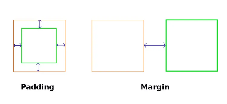
여기서
padding과 margin 이란?
margin 이란 네 방향 바깥 여백 영역을 설정하는 것
padding은 네 방향 안 쪽 여백 영역을 설정하는 것
차이점?
margin은 해당 요소의 주위에 빈 공간을 만드는 것이고,
padidng은 해당 요소의 내부에 빈 공간을 추가하는 것임
'2024_풀스택학원 > Front-end' 카테고리의 다른 글
| [HTML/CSS] Transform 속성과 예제 (0) | 2024.03.21 |
|---|---|
| [HTML/CSS] overflow-x, overflow-y / position 속성 (0) | 2024.03.20 |
| [CSS]CSS 적용 방법 , 선택자(Selector), display 속성 (0) | 2024.03.14 |
| [HTML]table 셀 병합, 입력 관련 태그 (1) | 2024.03.13 |
| [HTML] HTML구조, 기본 태그 (0) | 2024.03.12 |


